• The Art of ChoosingHome page
  • Fine Art Prints3 Editions
  • CollectionsAll Collections
  • AboutAmar Guillen
  • Customer Space & Contact
  • Select your language

    • English (United Kingdom)
    • Français (France)
  • All You Need to Select Your Fine Art Print
    • How to Choose a Fine Art Print - Q&A - FAQ
    • New Creations
    • Explore Some Interiors
    • Fine Art Print Blog
  • Browse by Edition
    • All Fine Art Prints
    • Unique Edition
    • Limited Edition
    • Open Edition
  • Browse by Style
    • Black and White
    • Color
    • Fusion
    • Impression
    • Back to Black
    • Landscapes in Black and White
    • Landscapes in Color
    • Animals in Black and White
    • Animals in Color
  • Browse by Theme
    • Landscape
    • Wildlife
    • Underwater
    • Abstract
    • Symbolic
    • Landscapes of the United States
    • Landscapes of France
    • Landscapes of Scotland
    • Seascapes
    • Relaxing
    • Energizing
    • Playful
  • Browse by Format
    • Rectangular
    • Square
    • Panoramic
  • Contact Me
    • Contact Me by Email or Phone
  • Collections
    • New Collections
    • All Collections
  • Browse by Theme
    • Landscapes
    • Wildlife
    • Underwater
    • Abstract
    • Symbolic
    • Landscapes of France
    • Landscapes of the United States
  • Browse by Style
    • Black and White
    • Color
    • Impression
    • Back to Black
    • Fusion
  • Contact Me
    • Contact Me by Email or Phone
  • Discover More About Me
    • Discover Who is Amar Guillen
    • Artistic and Photographic Statement
  • Galleries
    • Photo Galleries
    • Abstract Portfolio in Color
    • Black and White Landscape Photography Portfolio
    • Color Landscape Photography Portfolio
    • Black and White Wildlife Photography Portfolio
    • Color Wildlife Photography Portfolio
    • Underwater Photography Portfolio
  • Contact Me
    • Contact Me by Email or Phone
  • Your Customer Space
    • Create or Manage your Account
    • Your Download Space
    • Your Orders
  • Contact Me
    • Contact Me by Email or Phone

You are in that section: Home > Blog > Blog of the Photographic Creation Approach

Gradation and Rhythm: 2 Principles of Art that Help Your Photos Stand Apart

Photo of a colony of coral in Maldives to illustrate the 6th principle of art: the rythm. Photo by Amar Guillen.
The rhythm in this photo is given by the repetition of the patterns of hard corals: it is the 6th principle of art.

Principle #4: Accentuation

One definition of accentuation is as follows:

Action, manner of using graphic accents in writing or printing.

Accentuation implies augmentation. When applied to art, accentuation is a way of combining different elements to create tension between them.

When further applied to photography, accentuation is the process of creating differences between photographic elements so that they stand out from one another.

To accentuate your photographic compositions, you have tonal contrast at your disposal. The more contrast a scene has, the more attention it will draw from a viewer. Tonal contrast is when you accentuate the differences between the lighter and darker tones in a photo.

Tonal contrast is the one you are most likely to be familiar with and that naturally comes to mind when accentuation is mentioned. But you can also create color contrasts by playing with complementary colors.

Accentuation in a photo is also about creating size contrasts with a small element contrasting with a large element.

You also have the contrast of opacity with a transparent element that is in opposition with an opaque element.

Anything that can help accentuate the differences between the photographic elements of a scene is interesting to attract the eye.

As you can see, the accentuation is in contradiction or better the opposite of the principle of harmony. You are right. They are two opposing principles. That is why you must use them wisely.

The purpose of photography is to express yourself, to convey messages, to provoke introspection and to convey feelings and emotions. You must attract attention to meet this purpose. And to accomplish this, you must use means. Harmony and emphasis are two means at your disposal.

Principle #5: Gradation

One definition of gradation is as follows:

It is a progression by successive degrees and mostly upward.

Applied to art in general, gradation is the principle of combining a series of elements by making progressive changes. For example, show small items and then large items.

If I apply this principle of gradation to photography, it is a matter of combining the different photographic elements in a progressive way. In a photograph, the idea is not to create brutal borders in the changes of form, in the lights, the contrasts, or the tones.

The principle of gradation in photography is to not create abrupt changes in your compositions.

When you have an area with a light tone, avoid juxtaposing a very dark tone. It is certain that you will create contrast and attract the eye of the viewer, but ultimately this sudden change will shock him. It will not hold his attention for long on your photo.

When photographing two shapes, make sure they complement each other. A rounded shape and a triangle shape do not mix well.

Likewise with the colors, make sure that they are gradual and progressive. You will attract and maintain the attention of the viewer longer.

This principle of gradation avoids having a dominant element that draws the eye to the detriment of other elements or the story you want to tell.

You will probably think that this principle is valid for photos with wide shots because you have several photographic elements. This is not true. For close-up photography, this principle also applies perfectly. Think about tones and shapes. Even if you are doing a close-up, you want to tell a story and your photographic elements are parts of a larger element. You need to think in gradations so that the whole composition is harmonious.

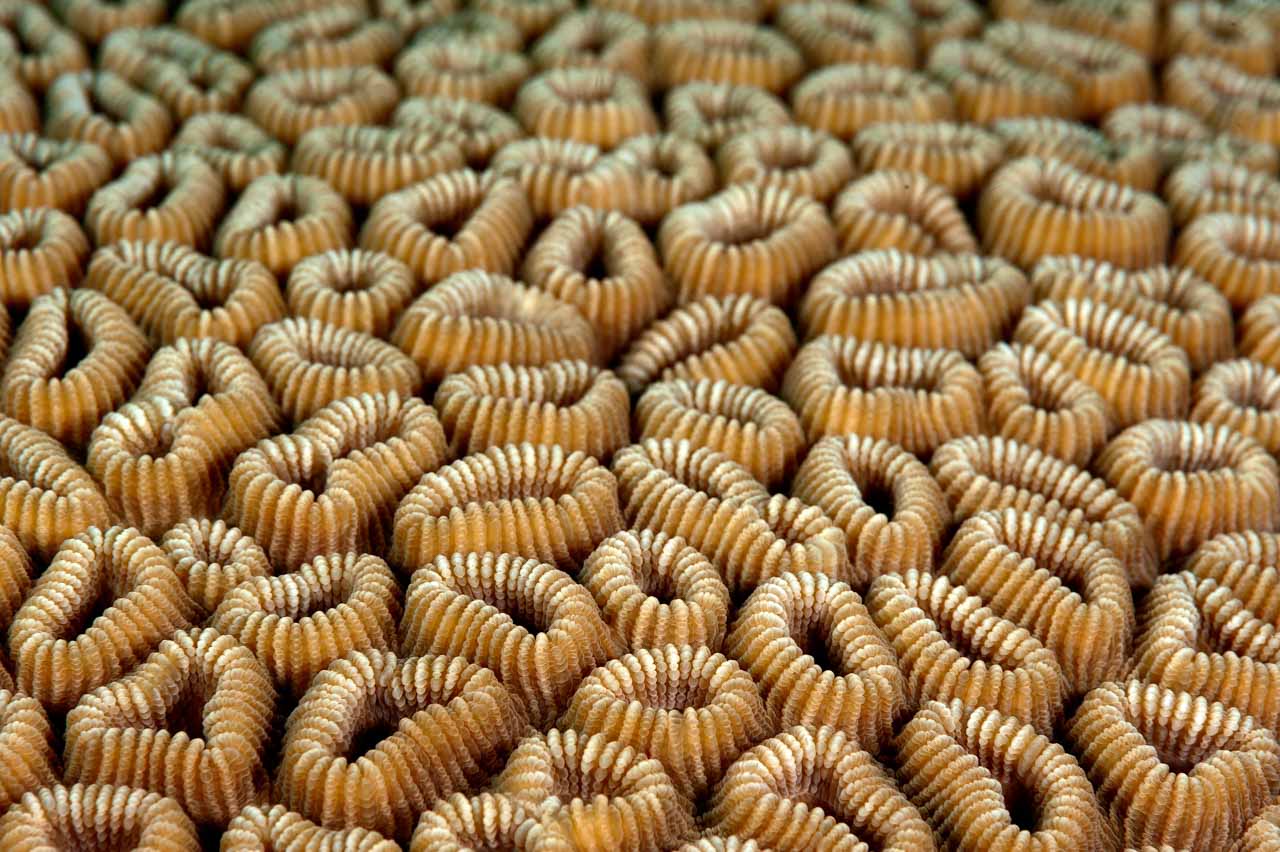
Principle #6: Rhythm

One definition of rhythm is as follows:

Order, [and] balance of a plastic or architectural work resulting from the proportion and arrangement of its parts.

But rhythm is also the return at regular intervals in time of a fact, of a phenomenon.

In art, the principle of rhythm designates the placement of elements that are repeated to give the illusion of movement. It thus becomes the tempo of a work.

In photography, rhythm is often evoked by patterns. Properly arranged in a photograph, they can create movement and direct a person's gaze in a given direction.

An example of this is the repetition of pebbles on a beach.

Generally speaking, rhythm in photography is obtained by repeating the same shape or figure. Often these forms are geometric.

But there are also forms of rhythm that are not geometric. They are for example clouds or waves on the surface of the water.

Rhythm can also be suggested by the repetition of a color or a tone. It is sometimes interesting to break the rhythm to avoid monotony. This way you can attract and hold the viewer's attention.

Principle #7: Variety

A definition of variety is as follows:

Character of something whose elements are diverse, [and] different.

Applied to art, variety is about the diversity of elements and contrast.

Variety is achieved by using different figures, shapes, sizes, tones, and colors.

If we apply this principle of variety to photography, it implies placing different photographic elements in a composition.

Variety is the opposite of uniqueness. Yet it is uniqueness that comes to mind when we talk about photography. It is indeed about placing a main subject within a composition to express oneself and impact the consciousness of a viewer.

You may have learned that if you put too many elements in a photo, you'll complicate the image and make it hard to read. Variety in photography is not about adding elements in a haphazard way just to fill the frame. It's about adding photographic elements to reinforce the message and accentuate the main subject.

By creating variety in a photo, you will create movement and tempo. Variety in a photographic composition allows you to break the rhythm.

A photo can very well respect the principle of variety while showing uniqueness. This is for example the case of a group of birds. The uniqueness is given by the group of birds. The variety is given by the different species.

Sometimes it is interesting to apply this principle of variety in a composition, because you need secondary elements to reinforce the main element. For example, you photograph a tree that is majestic. You can reinforce it with clouds or rocks to show its power and its strength.

If you are creating minimalist photos, this notion of variety will not be useful, because you will want to focus a viewer's attention on the main photographic element.

The principle of variety will depend on your style and your photographic vision.

You should especially remember that you should not add unnecessary photographic elements to your compositions. They will become disruptive, and they prevent the reading of your photos.

Principle #8: Movement

One of the definitions of the movement is the following:

Rhythm is an artistic work, a narrative, an intonation.

The principle of movement in art is to create the illusion and feeling of action.

Photography consists in reproducing a world in three “dynamic” dimensions, which is dynamic, on a support of two “static” dimensions.

The movement in photography can only be suggested. It cannot be real.

We can only give the impression of movement. It is the imagination and awareness of the viewer that will create the real movement.

In photography, to create movement, you have different techniques at your disposal:

  • Motion blur.
  • Position of the subject against the background.

These effects can be obtained directly at the shooting with low speeds. But they can be created in post-processing with software. It is necessary that the subject is clearly detached from the background.

Finally

I hope this article on the 8 Principles of Art and how to apply them to photography has opened some new creative avenues for you to explore in your future photos.

This article must be associated with the article on the 7 Elements of Art.

Each photographic creation does not necessarily apply to these 8 Principles. They are the foundations on which they are built and constructed. It is all a question of dosage and balance.

The artistic photos of interest were made by applying one or more principles.

For me, knowing these 8 Principles of Art is essential. Every photographer should know them by heart to build his pictures. Indeed, why reinvent the wheel when other people have already thought about it and created a foundation that is reliable and strong.

I am aware that I have not gone into all these concepts in great depth. I have given you the basics and the most important ones. Now that you have read the basics, all that is left for you to do is research and choose the concepts that you wish to apply to your photographic process. I wish you all the best on this next chapter in your photographic journey.

Be humble, patient, constant, persevering, and persistent because the road to excellence is long.

Balance and Proportion: 2 Principles of Art to Apply in Photography

This photo taken in Dombes on a foggy and sunny morning is balanced. The left and right sides attract the viewer in the same way.

Principle #2: Balance

By definition, balance is: "A just proportion of the elements of a whole."

This is not a very explicit definition for our artistic activity, because we have to define what is implied by 'right'.

If we apply this definition to art, balance is a way to give a sense of stability to a work of art. The two main concepts of balance in art are symmetry and asymmetry.

These two concepts may seem obvious, or easy to understand and imagine. However, they are not so easy to implement in photography, especially in nature photography.

Toute qui va dans Castle Valley dans l'Utah aux Etats-Unis.
This road leading to Castle Valley in Utah cuts the picture in half. It makes it balanced.

Balance in photography influences the composition of your photos. A good balance management creates harmonious photos (see previous paragraph).

A photo is said to be balanced when the left and right sides of a photo attract the viewer's attention in the same way. Neither side is dominant over the other.

To see if a photo is balanced, all you have to do is mentally draw a vertical line in the middle of the photo. Then, you check that there is a symmetry of masses, colors, tones, shapes, lines, and figures.

This is a fairly simple exercise to do. You just need a little practice.

You will probably think that you should consider the balance of the top and bottom half of your photos. You are right, but it is not very important. You can have for example a lot of elements at the bottom of a photo like mountains, trees, or rocks, and few elements at the top like a blue sky.

However, when you look at it, the photo is balanced. The human eye makes an analysis from the left to the right or from the right to the left. It all depends on the culture. The important thing is that the scan is done laterally.

The balance of a photo results in a harmonious photo.

Symmetry is the way to get a perfectly balanced photo.

In a symmetrical photo, the left and right sides have the same visual weight. You can fold the photo in half. The two parts overlap. This is also called formal balance.

Asymmetry is the second concept of photographic balance. It allows you to create more dynamic photos than symmetry. This is why the rule of thirds, the golden ratio, or the golden spiral was invented.

Let's say you frame a photo using the rule of thirds. For example, you place your main element on one of the highlights on the left. To create an asymmetrical photo, you simply highlight elements on the right as well.

They can be of different sizes, colors, and shapes. But they create a certain kind of balance.

At this point in the article, you may be wondering why it is important to create balanced or unbalanced photos.

A balanced photo creates visual harmony, stability, and tranquility. But it can also be static. Many photos that are balanced one after the other can become boring.

Creating unbalanced pictures creates the opportunity to include dynamism, tension, and action.

As always, in an artistic and expressive activity such as photography, everything will depend on the meaning you want to give whether it is through messages or studies. To balance your photo and reinforce its reading, you combine:

  • Colors.
  • Masses.
  • Shapes.
  • Tones.
  • Photographic attributes.
  • Elements.
  • Shades.

Whatever elements you use in your compositions, remember that the closer an element is to one side of the frame, the more visible it is and the more weight it has. I am not implying to place them very close to the edges, but you should strive to respect the rule of thirds, the golden ratio, and the golden spiral.

When you are in the field, you will visually arrange the elements of the scene to try to achieve photographic balance. You will use the grid of your viewfinder or your screen. But often, and especially in nature photography, it is not possible to control the elements.

This is where the development of your photos comes in. With a computer and retouching and correction software, you will crop or modify the saturation of certain colors, change the value of certain tones. You will improve and reinforce the balance of your photos.

This is an essential step in the creation of a photo.

To conclude this paragraph concerning the balance which is the second element of art to use in your photos, I will recommend you not to take everything at face value as always.

The balance can be symmetrical (formal) or asymmetrical (informal). A balanced photo gives stability. An unbalanced photo creates tension.

This principle of balance is a great way to make your photos interesting. But first you have to think about the meaning you want to convey. Then you think about balance. It is a tool and a means, not an end in itself.

Principle #3: Proportion

A definition of proportion is:

[An] Aesthetically satisfying relationship between two elements of a whole: balance of surfaces, masses, dimensions.

In art, proportion refers to the relationship of certain elements to each other and to the whole.

In photography, the principle of proportion consists in highlighting the subject of a photo by considering its size and its relationship with the rest of the image.

For example, proportion is used to show the size of a main element. For example, if you are photographing a small bird, you can place it next to a large animal to show its actual size.

The main subject does not always have to take up all the space in a photo. Proportion also helps to give an idea of distances. For example, everyone knows that a mountain is a natural formation that is very large. By creating a photo with a foreground and a mountain in the background, you give the impression that it is small. The viewer will interpret this fact as a great distance.

The principle of proportion in photography allows us to give a scale of values for both sizes and distances.

Proportion in photography establishes a relationship between the size of a photographic element when compared to another.

If the proportions are incorrect, the resulting image will not be realistic or abstract.

The Perfect Proportion

A photograph is often a rectangle.

I am using the case of most cameras that have a rectangular sensor. If you want to place your main subject in this rectangle to have a perfect proportion, you must place it on a strong point.

You have several techniques at your disposal: the rule of thirds, the golden spiral, etc.

But there is a so-called perfect proportion: the golden ratio.

By placing the most important point of your photo on this point, you will get the perfect proportion. That is, the ratio between the frame of the photo and the most important point in the image is perfect.

The golden ratio is also called the number of beauty. In the development tools, you have at your disposal different ways to crop. Take advantage of this to get images with perfect proportions.

Black and white photo of a red deer stag during the rut.
This photo of a deer during the slab is framed according to the principle of the golden ratio.

Principle #4: Accentuation

  1. Using the 8 Principles of Art to Create Photos
  2. The Figure: Uncovering the Second Element of Art
  3. How to Use Texture and Space in Artistic Photos
  4. The Line Is the First Element of Art to Use in Your Photos

Page 10 of 201

  • 5
  • 6
  • 7
  • 8
  • 9
  • 10
  • 11
  • 12
  • 13
  • 14
  1. You are here:  
  2. Home
  3. Blog Photographic Approach

Share on Social Media

Post
Share
Share
E-mail
WhatsApp
Text

Join Me on Social Networks

Join Me on Facebook  Join Me on Instagram  Join Me on LinkedIn

Claim your free guide to make your photo impactful and meaningful

Claim Your Free Guide '50 Pages of Tips to Give Impact and Meaning to Your Photos'.

4 + 8 =

Click Here To Discover All My Chronicles About the Photographic Approach.

Treat Yourself to a Fine Art Print That Matches your Personality

Example of a vacation home interior with a black and white fine photo art displayed on the wall.

Fine Art Print Collections in Black and White

Fine Art Print Collections in Black and White Black and white photography is a suitable technique for many nature scenes. It requires a particular frame of mind. A black and white photograph should be prepared and planned from the framing to the…
11991
Fine Art Print Collections in Black and White
An abstract art photo displayed in a contemporary living room decor.

Fine Art Print Collections in Color

Collections of Fine Art Prints in Color Color photographs allow digressions and take the audience to the message by secondary ways. The world around us, especially nature, is colorful. A color image can show the way our surroundings really are. Of course, it…
10440
Fine Art Print Collections in Color
Example of a home interior with fine art prints in my style back to black displayed on the wall. These photos are a part of my collection 'Wild beauties of Kenya'.

Fine Art Print Collections in Back to Black

Fine Art Print Collections in Back to Black I want to share my fine art prints of nature in a personal style that I call "back to black." "Back to Black" was developed to embody a sharp and clean style for artistic photos that can be hung in your living room,…
9980
Fine Art Print Collections in Back to Black
A waiting room with a photo in the style Fusion displayed on the wall. Grey Heron in Fusion.

Fine Art Print Collections with the Fusion Style

Fine Art Print Collections with the Fusion Style I would like to share a very creative and modern photography style to represent Nature in a very different way. I call it "Fusion." I created the style to offer dynamic photos, allowing you to start a good day…
7908
Fine Art Print Collections with the Fusion Style
A living room with a photo in the style 'Impression' exposed on the wall. Rising sun in impression

Fine Art Print Collections with the ‘Impression’ Style

Fine Art Print Collections with the ‘Impression’ Style The objective of this photographic style is to create the ephemeral blurs. That's why I named it 'Impression.' Photography, as an art form, is a powerful means of expressing reality from different…
5827
Fine Art Print Collections with the ‘Impression’ Style
Fine art prints from the style back to black displayed on a wall. Amar Guillen, photographer artist

New Collections of Fine Art Prints Dedicated to the Wonders of Nature

New and Updated Fine Art Print Collections Dedicated to the Wonders of Nature Fine art prints from the style back to black displayed on a wall.
11446
New Collections of Fine Art Prints Dedicated to the Wonders of Nature

Themes of the Blog Articles

Landscape of Arches National Park in Utah in black and white.

Blog Articles Dedicated to Artist Statement

Blog Articles Dedicated to Artist Statement
Dunes of death Valley in Black and White

Blog Articles Dedicated to Black and White Photography

Blog Articles Dedicated to Black and White Photography
Abstract photo or trees reflection on water

Blog Articles Dedicated to Photographic Mindset

Blog Articles Dedicated to Photographic Mindset
Abstract photo of ridles on water

Blog Articles Dedicated to Artistic Photography

Blog Articles Dedicated to Artistic Photography
Abstract photo of Yellowstone

Blog Articles Dedicated to Photographic Language

Blog Articles Dedicated to Photographic Language
Pronghorn in Yellowstone

Blog Articles Dedicated to Wildlife Photography

Blog Articles Dedicated to Wildlife Photography
Landscape of Bryce Canyon

Blog Articles Dedicated to Photographing United States

Blog Articles Dedicated to Photographing United States
Underwater waves in the Red Sea

Blog Articles Dedicated to Photographic Techniques

Blog Articles Dedicated to Photographic Techniques
Tree of Black Canyon in Black and White

Blog Articles Dedicated to Landscape Photography

Blog Articles Dedicated to Landscape Photography
Manta Ray in Maldives in Black and White

Blog Articles Dedicated to Underwater Photography

Blog Articles Dedicated to Underwater Photography
Red Deer stag during the rut of the deer

Blog Articles Dedicated to Photographic Judgement

Blog Articles Dedicated to Photographic Judgement
Great Crested Greb and his chick

Unclassified Blog Articles

Unclassified Blog Articles

You Might Be Interested By One of These Photographic Approach Articles

Photograph in black and white of the Grand Canyon from Arizona State in USA.

Why and How Mastering the Steps of Creating an Art Photograph

3603
Why and How Mastering the Steps of Creating an Art Photograph
An example of a narrative photo. Landscape of Island in the Sky in the Canyonlands in Utah in United States. Photo in black and white by Amar Guillen.

Why and How: Creating Impactful Narrative Photos

4118
Why and How: Creating Impactful Narrative Photos
Snowy landscape of Yellowstone during winter.

3 Steps for Giving Meaning to Your Photos

8750
3 Steps for Giving Meaning to Your Photos
Two lions in Kenya. Photographed in black and white. Photograph by Amar Guillen, photographer artist.

To Create Aesthetics Photos, Print your Images

4238
To Create Aesthetics Photos, Print your Images

Receive Free Tips On How to Give Impact and Meaning to Your Photos. Subscribe to Receive Regular Articles.

2 + 7 =

Contact Me By Email

10 + 9 =
This site is protected by reCAPTCHA and the Google Privacy Policy and Terms of Service apply.

About Amar Guillen, Creator of Fine Art Prints of Nature
As a photographer capturing the artistic essence for several decades, I have mastered the art of crafting an authentic experience for art enthusiasts and collectors of visual art.
When I observe my surroundings, be it friends, family, relationships, or professional contacts, I see souls in perpetual motion. Every moment of their existence is engulfed by daily hassles, work concerns, social media, online or televised information streams, and videos on the web.
Every minute, they strive to accomplish something, fearing losing ground and feeling marginalized in this frenzied society. Imprisoned by an oppressive schedule, the essential eludes them, drowned in the tumult of daily life. Is it really crucial to watch yet another cat video on the internet? Is it necessary to post twenty daily messages on social media?
Despite this, they remain constantly stressed and anxious about the challenges of the world, without being able to influence these monumental problems. It is at this moment that my artistic nature photographs come into play. Those who have had the privilege of hanging one of my works in their personal or professional space have expressed a radical transformation in their lives.
Every day, contemplating these works of art immerses them in tranquility, inner peace, and rediscovered serenity. They then understand that nature has the power to unravel tensions, to encourage reflection on the essential. Artistic photographs thus become open windows to the wonders of nature.
I have chosen to share the best of myself by helping others discover their identity, personality, style, all while reconnecting with nature. Take the time to explore my artistic photographs if you wish to reveal your true essence. Once hung in your space, your view of the world will be transformed.
Amar Guillen is a creator of fine art prints of nature.
I am Amar Guillen, creator of nature art photographs. I have a deep conviction that contemplating nature has the power to transform human beings. If everyone learned to know, respect, and preserve nature, our world would be transformed into a haven of peace where everyone would find their place.
Copyright © 2003 - 2026 Guillen Photo LLC - All rights reserved. Amar Guillen, professional photographer since 2003.
  • Blog
  • Calibration
  • Legal Information
  • Sitemap
  • Accessibility
  • Contact Me
  • Updates of the Website
I Want to Help You to Create Interesting Photos

How Can I Help You To Create More Interesting Photos?

Ask Me a Technical Question.
Subscribe to my Newsletter. The Inspiration Behind Guillen Photo.

Select your language

  • English (United Kingdom)
  • Français (France)
Claim your free guide to make your photo impactful and meaningful

Claim Your Free Guide '50 Pages of Tips to Give Impact and Meaning to Your Photos'.

1 + 6 =

Contact Me By Email

2 + 4 =

Office Address:
3512 Robin Road
Plano Texas 75075
USA

Office phone: (+1)214-769-6825