• The Art of ChoosingHome page
  • Fine Art Prints3 Editions
  • CollectionsAll Collections
  • AboutAmar Guillen
  • Customer Space & Contact
  • Select your language

    • English (United Kingdom)
    • Français (France)
  • All You Need to Select Your Fine Art Print
    • How to Choose a Fine Art Print - Q&A - FAQ
    • New Creations
    • Explore Some Interiors
    • Fine Art Print Blog
  • Browse by Edition
    • All Fine Art Prints
    • Unique Edition
    • Limited Edition
    • Open Edition
  • Browse by Style
    • Black and White
    • Color
    • Fusion
    • Impression
    • Back to Black
    • Landscapes in Black and White
    • Landscapes in Color
    • Animals in Black and White
    • Animals in Color
  • Browse by Theme
    • Landscape
    • Wildlife
    • Underwater
    • Abstract
    • Symbolic
    • Landscapes of the United States
    • Landscapes of France
    • Landscapes of Scotland
    • Seascapes
    • Relaxing
    • Energizing
    • Playful
  • Browse by Format
    • Rectangular
    • Square
    • Panoramic
  • Contact Me
    • Contact Me by Email or Phone
  • Collections
    • New Collections
    • All Collections
  • Browse by Theme
    • Landscapes
    • Wildlife
    • Underwater
    • Abstract
    • Symbolic
    • Landscapes of France
    • Landscapes of the United States
  • Browse by Style
    • Black and White
    • Color
    • Impression
    • Back to Black
    • Fusion
  • Contact Me
    • Contact Me by Email or Phone
  • Discover More About Me
    • Discover Who is Amar Guillen
    • Artistic and Photographic Statement
  • Galleries
    • Photo Galleries
    • Abstract Portfolio in Color
    • Black and White Landscape Photography Portfolio
    • Color Landscape Photography Portfolio
    • Black and White Wildlife Photography Portfolio
    • Color Wildlife Photography Portfolio
    • Underwater Photography Portfolio
  • Contact Me
    • Contact Me by Email or Phone
  • Your Customer Space
    • Create or Manage your Account
    • Your Download Space
    • Your Orders
  • Contact Me
    • Contact Me by Email or Phone

You are in that section: Home > Blog > Blog of the Photographic Creation Approach

How to Use Texture and Space in Artistic Photos

Example of the use of textures in a photo. A young gelada sheltered in its mother's fur
Example of the use of textures in a photo. A young gelada sheltered in its mother's fur.

Element #4 of Art: Wielding Color

Color is one of the 7 essential elements of art. It is created when light is reflected in the eye of a viewer of a scene or object.

How to Enhance Colors in Nature Photography.

There is a model that has become universal to classify colors: the color wheel. It was developed by Isaac Newton who took the spectrum of colors and folded it into a circle. This color wheel shows:

  • Primary colors: they cannot be mixed.
  • Secondary colors. Each of them is obtained by mixing two primary colors.
  • Tertiary colors. Each of them is obtained by mixing a primary color and a secondary color.

The 3 primary colors are cyan (blue), magenta (red) and yellow.

The 3 secondary colors are green (cyan + yellow), purple (cyan + magenta) and orange (yellow + magenta).

The tertiary colors are red (red + orange), orange yellow (yellow-orange), light green (yellow + green), turquoise (blue + green), indigo (blue + violet), purple (violet + red).

Colors are said to be complementary when they are opposite on the color wheel. This is a concept that you must keep in mind because their association in your photos can attract the eye of the viewer by contrast effect. For example, red and green, blue and yellow.

Colors are said to be analogous when they follow each other on the color wheel and are composed of the same primary color. For example, yellow and red are both composed of the same primary color.

This notion of analogous colors is important to create smooth transitions and gradients in your photos.

Without going too long into this explanation of the 4th element, it seems important to me to say that there are also hot colors and cold colors.

The warm colors are red, orange and yellow.

Cool colors are green, blue and purple.

Warm colors seem to move forward. They take up more space than cold colors in a photo.

Cool colors seem to recede. They are ideal colors to give depth to your photos.

Finally, each color has properties:

  • Hue.
  • Intensity.
  • Value.

The hue of a color refers to its name: for example, red, blue, green, etc..

The intensity of a color qualifies its purity. I am talking about vividness. A color is said to be of high intensity if it is pure, without any mixture. It is said to be of low intensity if it is the result of a mixture. Sometimes you will also hear about chroma for intensity, saturation, chrominance. All these terms qualify the same property.

The value of a color qualifies its lightness or darkness compared to white or black. For example, yellow is a light value, because it is close to white. Blue is a dark value because it is close to black. Often you hear brightness used to refer to value.

Now that you have in mind all the characteristics of colors, it is interesting to understand why to use them to create your photos.

Colors in photography are not only used to show reality. They have a real language. They allow you to give meaning to your photos. The colors can be used with a semantic purpose.

The red color is synonymous with power, energy, strength, passion, love. It can also represent danger, revolt.

The yellow color evokes optimism, joy of living, warmth and light. But it can also have negative connotations such as lying and deceit.

The green color evokes optimism, hope and growth. But taken negatively, it can evoke misfortune.

The purple purple evokes mystery, spirituality, magic, elegance. Taken in a negative way, it can evoke melancholy or loneliness.

The orange color evokes ambition, enthusiasm, energy, action. Taken negatively, it is a color that evokes excess.

The pink color evokes femininity, romance, softness, innocence. It can also evoke childhood, innocence.

The blue color evokes reliability, truth, tranquility.

The brown color evokes authenticity, naturalness. But beware, when it is dominant in a photo, it can give a bland appearance.

The black color evokes rigor, sophistication, elegance, timelessness. But interpreted negatively, it can evoke sadness, death, mourning.

The white color evokes purity! cleanliness, perfection, innocence, virginity. Taken negatively, it can evoke the lack of content, the absence of depth, and the superficiality of life itself.

The use of colors in your photos must be carefully studied.

For example, if you make photos with a strong red color, people will have a very strong instant energy. But once this phase is over, they will fall back into lethargy.

If you create green-dominant buddies, the viewers will have lower energy than with red, but they will remain active. Green also evokes the balance. That's why photos of rooms with exuberant people on display help calm them down.

In an office, pictures hung on the walls with a red dominance show power, energy.

I hope these few examples show you how useful it is to control the colors within your photos.

Element #5 of Art to Use in Your Photos: the Value

The value qualifies the brightness of a tone in the context of an image.

A tone is either light or dark. The value indicates how light or dark something is. The value is always associated with a color. The lightest value is white. The darkest value is black.

Values are relative to each other. The neighborhood of a light tone gives a dark value to a color that would have a brighter value in the neighborhood of a dark tone.

The value indicates the degree of brightness or darkness of each color. For your photographs, value is an essential element. Getting the values right is more important than getting the colors right.

Indeed, the value is what allows one to show three-dimensional shapes on a two-dimensional surface.

If you increase the value differences in your photos, you will increase the contrast. You will attract the eye of a viewer more easily. You will attract his attention. Your photos will be more interesting. Then, all you have to do is give them meaning.

The decrease in value differences will result in less contrast. Your photos will attract less attention.

When taking a picture in the field, you should try to have your focal point with as much contrast as possible to easily catch the eye of the viewer.

If you create photos with rather dark values, they will be subdued. You will evoke a heavy, mysterious, dramatic, dark feeling. These are the low-key photos.

If you create photos with rather bright values, you will give a feeling of lightness, speed, spirituality, dream, escape. These are the high-energy type of photos.

In photography, it is possible to manage the values of your photos well. It is for example, the use of the very morning light or twilight when the sun is low.

But for me, developing a photo with a computer and software is still a great way to refine the contrast. By using tools like the gradient or the brush, I can modify the values of my tones to amplify the contrast of my photos.

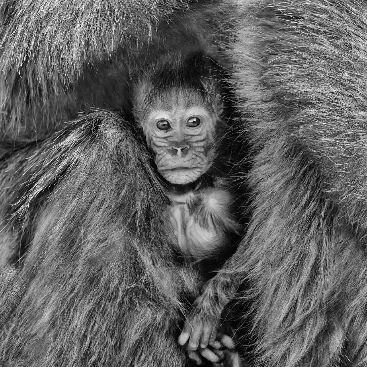
Element #6 of Art: Texture

Real texture is the sensation of an object to the touch.

Your photos represent a three-dimensional world on a two-dimensional surface. It is impossible to create the effect of the textures you are photographing, whether it is the fur of a mammal, the plumage of a bird or the roughness of a tree trunk.

You can evoke it with the texture of the paper you use when printing your photos, but that is not the subject of this paragraph. To convey the illusion of real texture to the viewer, you must pay attention to your color values and light. Indeed, every textured surface in nature will reflect light in a very particular way. You need to pay attention to this to be sure and reflect the textures right.

You must always have in mind that the texture in your photos must evoke touch. You almost have to provoke in the viewer this desire to take or to touch your photographic subjects.

In photography, textures are visual and therefore implicit, unlike in other art forms such as sculpture or architecture. Textures can be smooth, rough, hard, soft, hairy, bumpy, etc.

Element #7 of Art to Use in Your Photos: the Space

Here we come to the last element used in art. It is as essential as the others. So far I have explained lines, figures, shapes and then color, value and texture.

Space is defined as the placement of lines, figures and shapes.

In art, there are two types of space:

  • Positive space.
  • Negative space.

The positive space is the space occupied by your subject and everything related to it such as its shadow or secondary subjects that help to better understand a work.

Negative space is the space that extends around your subject as the foreground and background.

In wildlife photography, the positive space is the animal if it is alone in the picture. The rest is the negative space. Often, it characterizes its habitat.

In landscape photography, the positive space is the subject or the point of attention of the photo. The negative space is made up of all the elements that will contribute to emphasize this point of attention.

In photography, this concept of space is essential. Indeed, you can analyze a photo by breaking it down into 3 elements:

  • Foreground.
  • Background.
  • Subject.

You can also break it down into spaces:

  • Negative space
  • Positive space.

You can judge a photo by judging the elements or spaces.

If you wish to learn more about judging elements or spaces, feel free to discover more on this page.

For me, negative space is essential. Indeed, I realize very few close-ups. My photos are often wide shots. This way of photographing corresponds to my photographic approach. When I photograph a subject, it occupies little space in the photo. I must manage the negative space well.

Here are some questions I ask myself when I take a picture:

  • Is my subject breathing? Do I leave enough negative space around my subject?
  • Does my negative space need to be balanced on each side of the subject?
  • Should I reduce my negative space because it is too eye-catching?
  • etc.

The management of the space or of both spaces (negative or positive) is essential to understand for you. The better you understand them, the better your photos will be.

You will improve the placement of subjects in your photos. You will understand how to use perspective.

You will be able to create effects by establishing size references, for example.

You will also be able to better manage the colors and values. For example, I recommend that you use cool colors in the background to give an idea of escape and infinity. Dark values are interesting for the foreground where they give the impression of a walk that literally appears to enter into the photo.

Why and How It Is Important To Manage The Negative Space In Nature Photo.

Finally

I hope this article about using the 7 elements of art will give you new creative ways to make your photos.

Whether it is a line, figure, shape, color, value, texture, space, each element is essential to analyze, understand, and master.

They are the basis for creating interesting and balanced photos. By playing and modulating these elements, you will write stories with your photos. You will give them meaning. You will be understood. They are the basis of the language and writing of photography.

Please take the time to read this article again. It is one of the foundations of your photographic approach.

Be humble, patient, constant, persevering, and persistent because the road to excellence is long.

The Line Is the First Element of Art to Use in Your Photos

Abstract photo of waves on the surface of the water. The horizontal lines give the photo a sense of tranquility. They are soothing.

Incorporating the Horizontal Line in Photography

If you want to use the line in photography, I'm sure the first idea you will have in mind is the horizontal line.

The horizontal line is certainly the most used graphic element in photography. The horizon is certainly the most used horizontal line in photography.

It is an anchor point around which you can articulate your compositions.

But be careful because it is not very simple to place well.

A horizontal line in a photo reads like an organic presence. Human beings generally sleep in a horizontal position. That's why we associate horizontal lines with relaxation, rest and stability. Similarly, when we watch the sun rise or fall over the horizon, it evokes the feeling of time passing. It is an unchanging rhythm.

Another interesting fact is that most of our movements are on horizontal paths. A horizontal line in a photo also evoking movement.

If you place your horizon line in the middle of your photo, you will have a well-balanced and well-proportioned composition with half sky and half land. For the viewer, you will provoke a feeling of balance. But personally, I find this kind of composition lacking in boldness and creativity. You don't step out of your comfort zone. You don't take any risks. You just go with the average and try to satisfy everyone.

Personally, I always try to place the horizon line in the lower or upper third of the photo. It will depend on the subject I want to highlight.

When a sky is very cloudy and I want to express anger, disorder, hubbub I will place my horizon line in the lower third. When, for example, I photograph dunes, I put the horizon line in the upper third.

A linear horizon often results in calm, serene, but static photos. But the horizon line is not the only possible horizontal line in photography.

I often use waves on the water to create my abstract plates.

Here are some photos that evoke calm and serenity. They are very relaxing.

A horizontal line is the most static in photography. It is not dynamic. It does not create depth unless several horizontals are aligned. In this case, they generate a pattern effect that can become boring. It is in this case that it is interesting to add an element, as it will break the pattern.

Example of a horizontal line in photography. The horizon line.

Using the Vertical Line in Photography

The vertical line is the most used line in photography after the horizontal line. It evokes elevation, growth, movement, domination, power. A vertical line is often reinforced by a vertical framing.

If you want to highlight vertical lines, feel free to have them as close to the edges of your photo as possible.

The viewer will then compare them to the vertical sides of the frame. This technique accentuates the height of the subject.

Framing vertical lines horizontally, especially repeating lines, will create a sense of repetition and a sense of depth.

This is the case, for example, with an alignment of trees in a photo. The viewer will mentally create a perspective and project himself into the photo.

A vertical line that cuts the bottom of a photo causes a break, a cut that will divide the image. You will create a symmetry effect. You can place this vertical line in the center of the image or slightly offset to respect the rule of thirds.

If you want to create tension in a photo, I advise you to alternate vertical and horizontal lines. You will create a surprise effect for the viewer. This is why close-up shots of flowers or leaves can be so captivating. While one may say that it is just a boring leaf, a close up shot reveals the alternation of vertical and horizontal lines. It is like a kaleidoscope for the human eye. The same can be said about a butterfly, a shell, a flower, etc.

Like the horizontal line, the vertical line creates stability and order. A vertical line is not dynamic and does not bring depth to a photo. It is the alignment of vertical lines that can create perspective.

Its purpose is to propose a division of the photo.

We are bipeds. We walk upright in a vertical position.

This position symbolizes for us energy, action. It is also a movement, because we can move. That's why using the vertical line in your photos allows you to symbolize endurance and vitality. The vertical line also delineates the growth of the timeline.

Example of vertical lines in photography. Reflections of trees on water
Example of vertical lines in photography. Reflections of trees on water.

Using Diagonal Lines in Photography

The purpose of the diagonal in photography is to make your photos more dynamic.

It will allow you to create an impression of movement and depth.

A diagonal line in a photo causes a sense of instability and precariousness. The first technique for creating a diagonal line is to tilt your camera slightly. You will then use horizontal or vertical lines to transform them.

Another example is paths or roads. To create a depth effect, simply start it in one of the lower corners of your photo to suggest travel. A diagonal line also guides the viewer's eye to a point in the photo.

The diagonal league is powerful in photography. It is a dynamic line.

It can be impetuous because it forces the viewer to follow it. One may heavily incorporate diagonals when photographing the wind blowing through trees, or sunbeams gently shimmering through the water.

The diagonal line brings fantasy to a photo.

It represents strength and vitality. It gives an idea of movement and direction stronger than the horizontal or diagonal line.

The more angled a diagonal line forms with the edge of the frame, the more dynamic it will be.

The diagonal line is, for you as a photographer, one of the main tools to create depth, thanks to the linear perspective. If you use the principle of converging lines, you will give this impression.

The angle of a diagonal line depends on the position of the photographer. This angle depends on his point of view. Lowering or raising yourself immediately changes the layout of a diagonal line.

The use of several diagonal lines in a photo can create elevation. They can create a vibration that plays with our vision like an optical illusion.

Diagonal lines generate a lot of energy in a single photo.

The diagonal lines direct the viewer's gaze to the right at the bottom of the photo.

Using the Zigzag Line in Photography

The zigzag lines create a sense of movement and agitation.

These are for example mountain ranges or waves.

A zigzag line breaks the rhythm, it destabilizes the status quo. It is a very strong line to suggest emotions like fear, anger or surprise.

A zigzag line can complement a vertical or horizontal line to create a duality between stability and disorder.

You may spot zigzag lines in nature in animal tracks, such as a snake crossing a path in the sand, or in the silhouette of a live action shot of a bird leaping into flight.

The zigzag lines destabilize the photo. They ask the viewer for attention.

Use of Curved Lines in Photography

The curved line is one of the most common lines you can find in nature. It is for example dunes, the top of a tree. Curved lines are everywhere.

When you photograph it, you may think of softness, calm, and comfort.

For a viewer, the curved line is easy to read. It is soothing and relaxing. There is no conflict suggested. The angles are rounded, thus suggesting consensus.

They also express sensuality, for example, one can almost feel the heat of the sun bouncing off the glowing sand dunes, or the spray of an ocean wave coming towards the viewer. A curved line can also express softness, such as the curved silhouette of a mother deer leaning in towards her fawn, or a fern delicately bowing down to the earth.

Like the diagonal line, the curved line can express movement. But in a much more subtle way. Indeed, it is less directive. The eye of the viewer will follow it in a natural way, as it is a very dynamic line.

It gradually changes the direction of the eye. The curved line brings elegance to a photo. Imagine the movement of a high fashion garment worn by a model. The fabrics twirl while giving elegance.

The effect of a curved league is enhanced by the focal length of a wide-angle lens.

Curved lines induce activity, liveliness on the contrary of straight lines like the horizontal line, the vertical line or the diagonal line which induces stability, relaxation.

The curved lines induce and give rhythm. They provide a sense of calm and ease.

Using Imaginary Lines in Photography

The imaginary line is also called the implicit line. It is created by the other visual components of a photo: the lines of sight, the movements, the direction of a glance, etc.

An imaginary line does not physically exist like a horizon line or the trunk of a tree. It is guessed. It is suggested. Yet it draws the viewer's eye from one point to another in a photograph.

An imaginary line gives momentum and narrative to a photo even if it is invisible. For example, one may spot imaginary lines when seeing

  • Direction of a glance.
  • Drawing on a sand.

Although these images do not directly portray a physical line, one can see the line that is implied from the setting and tone of the photo.

Example of an imaginary line in photography. Looking outside of the frame.

The Characteristics of a Line

  1. Using the 7 Elements of Art to Capture and Create Your Photos
  2. Creatively Photographing Birds in La Dombes
  3. To Create Interesting Photos, Master the Photographic Writing
  4. Define Your Photographic Approach to Create Interesting Photos

Page 12 of 201

  • 7
  • 8
  • 9
  • 10
  • 11
  • 12
  • 13
  • 14
  • 15
  • 16
  1. You are here:  
  2. Home
  3. Blog Photographic Approach

Share on Social Media

Post
Share
Share
E-mail
WhatsApp
Text

Join Me on Social Networks

Join Me on Facebook  Join Me on Instagram  Join Me on LinkedIn

Claim your free guide to make your photo impactful and meaningful

Claim Your Free Guide '50 Pages of Tips to Give Impact and Meaning to Your Photos'.

4 + 8 =

Click Here To Discover All My Chronicles About the Photographic Approach.

Treat Yourself to a Fine Art Print That Matches your Personality

Example of a vacation home interior with a black and white fine photo art displayed on the wall.

Fine Art Print Collections in Black and White

Fine Art Print Collections in Black and White Black and white photography is a suitable technique for many nature scenes. It requires a particular frame of mind. A black and white photograph should be prepared and planned from the framing to the…
11991
Fine Art Print Collections in Black and White
An abstract art photo displayed in a contemporary living room decor.

Fine Art Print Collections in Color

Collections of Fine Art Prints in Color Color photographs allow digressions and take the audience to the message by secondary ways. The world around us, especially nature, is colorful. A color image can show the way our surroundings really are. Of course, it…
10440
Fine Art Print Collections in Color
Example of a home interior with fine art prints in my style back to black displayed on the wall. These photos are a part of my collection 'Wild beauties of Kenya'.

Fine Art Print Collections in Back to Black

Fine Art Print Collections in Back to Black I want to share my fine art prints of nature in a personal style that I call "back to black." "Back to Black" was developed to embody a sharp and clean style for artistic photos that can be hung in your living room,…
9980
Fine Art Print Collections in Back to Black
A waiting room with a photo in the style Fusion displayed on the wall. Grey Heron in Fusion.

Fine Art Print Collections with the Fusion Style

Fine Art Print Collections with the Fusion Style I would like to share a very creative and modern photography style to represent Nature in a very different way. I call it "Fusion." I created the style to offer dynamic photos, allowing you to start a good day…
7908
Fine Art Print Collections with the Fusion Style
A living room with a photo in the style 'Impression' exposed on the wall. Rising sun in impression

Fine Art Print Collections with the ‘Impression’ Style

Fine Art Print Collections with the ‘Impression’ Style The objective of this photographic style is to create the ephemeral blurs. That's why I named it 'Impression.' Photography, as an art form, is a powerful means of expressing reality from different…
5827
Fine Art Print Collections with the ‘Impression’ Style
Fine art prints from the style back to black displayed on a wall. Amar Guillen, photographer artist

New Collections of Fine Art Prints Dedicated to the Wonders of Nature

New and Updated Fine Art Print Collections Dedicated to the Wonders of Nature Fine art prints from the style back to black displayed on a wall.
11446
New Collections of Fine Art Prints Dedicated to the Wonders of Nature

Themes of the Blog Articles

Landscape of Arches National Park in Utah in black and white.

Blog Articles Dedicated to Artist Statement

Blog Articles Dedicated to Artist Statement
Dunes of death Valley in Black and White

Blog Articles Dedicated to Black and White Photography

Blog Articles Dedicated to Black and White Photography
Abstract photo or trees reflection on water

Blog Articles Dedicated to Photographic Mindset

Blog Articles Dedicated to Photographic Mindset
Abstract photo of ridles on water

Blog Articles Dedicated to Artistic Photography

Blog Articles Dedicated to Artistic Photography
Abstract photo of Yellowstone

Blog Articles Dedicated to Photographic Language

Blog Articles Dedicated to Photographic Language
Pronghorn in Yellowstone

Blog Articles Dedicated to Wildlife Photography

Blog Articles Dedicated to Wildlife Photography
Landscape of Bryce Canyon

Blog Articles Dedicated to Photographing United States

Blog Articles Dedicated to Photographing United States
Underwater waves in the Red Sea

Blog Articles Dedicated to Photographic Techniques

Blog Articles Dedicated to Photographic Techniques
Tree of Black Canyon in Black and White

Blog Articles Dedicated to Landscape Photography

Blog Articles Dedicated to Landscape Photography
Manta Ray in Maldives in Black and White

Blog Articles Dedicated to Underwater Photography

Blog Articles Dedicated to Underwater Photography
Red Deer stag during the rut of the deer

Blog Articles Dedicated to Photographic Judgement

Blog Articles Dedicated to Photographic Judgement
Great Crested Greb and his chick

Unclassified Blog Articles

Unclassified Blog Articles

You Might Be Interested By One of These Photographic Approach Articles

Photograph in black and white of the Grand Canyon from Arizona State in USA.

Why and How Mastering the Steps of Creating an Art Photograph

3603
Why and How Mastering the Steps of Creating an Art Photograph
An example of a narrative photo. Landscape of Island in the Sky in the Canyonlands in Utah in United States. Photo in black and white by Amar Guillen.

Why and How: Creating Impactful Narrative Photos

4118
Why and How: Creating Impactful Narrative Photos
Snowy landscape of Yellowstone during winter.

3 Steps for Giving Meaning to Your Photos

8750
3 Steps for Giving Meaning to Your Photos
Two lions in Kenya. Photographed in black and white. Photograph by Amar Guillen, photographer artist.

To Create Aesthetics Photos, Print your Images

4238
To Create Aesthetics Photos, Print your Images

Receive Free Tips On How to Give Impact and Meaning to Your Photos. Subscribe to Receive Regular Articles.

2 + 7 =

Contact Me By Email

10 + 9 =
This site is protected by reCAPTCHA and the Google Privacy Policy and Terms of Service apply.

About Amar Guillen, Creator of Fine Art Prints of Nature
As a photographer capturing the artistic essence for several decades, I have mastered the art of crafting an authentic experience for art enthusiasts and collectors of visual art.
When I observe my surroundings, be it friends, family, relationships, or professional contacts, I see souls in perpetual motion. Every moment of their existence is engulfed by daily hassles, work concerns, social media, online or televised information streams, and videos on the web.
Every minute, they strive to accomplish something, fearing losing ground and feeling marginalized in this frenzied society. Imprisoned by an oppressive schedule, the essential eludes them, drowned in the tumult of daily life. Is it really crucial to watch yet another cat video on the internet? Is it necessary to post twenty daily messages on social media?
Despite this, they remain constantly stressed and anxious about the challenges of the world, without being able to influence these monumental problems. It is at this moment that my artistic nature photographs come into play. Those who have had the privilege of hanging one of my works in their personal or professional space have expressed a radical transformation in their lives.
Every day, contemplating these works of art immerses them in tranquility, inner peace, and rediscovered serenity. They then understand that nature has the power to unravel tensions, to encourage reflection on the essential. Artistic photographs thus become open windows to the wonders of nature.
I have chosen to share the best of myself by helping others discover their identity, personality, style, all while reconnecting with nature. Take the time to explore my artistic photographs if you wish to reveal your true essence. Once hung in your space, your view of the world will be transformed.
Amar Guillen is a creator of fine art prints of nature.
I am Amar Guillen, creator of nature art photographs. I have a deep conviction that contemplating nature has the power to transform human beings. If everyone learned to know, respect, and preserve nature, our world would be transformed into a haven of peace where everyone would find their place.
Copyright © 2003 - 2026 Guillen Photo LLC - All rights reserved. Amar Guillen, professional photographer since 2003.
  • Blog
  • Calibration
  • Legal Information
  • Sitemap
  • Accessibility
  • Contact Me
  • Updates of the Website
I Want to Help You to Create Interesting Photos

How Can I Help You To Create More Interesting Photos?

Ask Me a Technical Question.
Subscribe to my Newsletter. The Inspiration Behind Guillen Photo.

Select your language

  • English (United Kingdom)
  • Français (France)
Claim your free guide to make your photo impactful and meaningful

Claim Your Free Guide '50 Pages of Tips to Give Impact and Meaning to Your Photos'.

10 + 2 =

Contact Me By Email

7 + 1 =

Office Address:
3512 Robin Road
Plano Texas 75075
USA

Office phone: (+1)214-769-6825